Colours, position and fonts
The widget should look like part of your site, not a bolt-on. Every change here updates the live preview on the right, so you see the result before you save a thing.
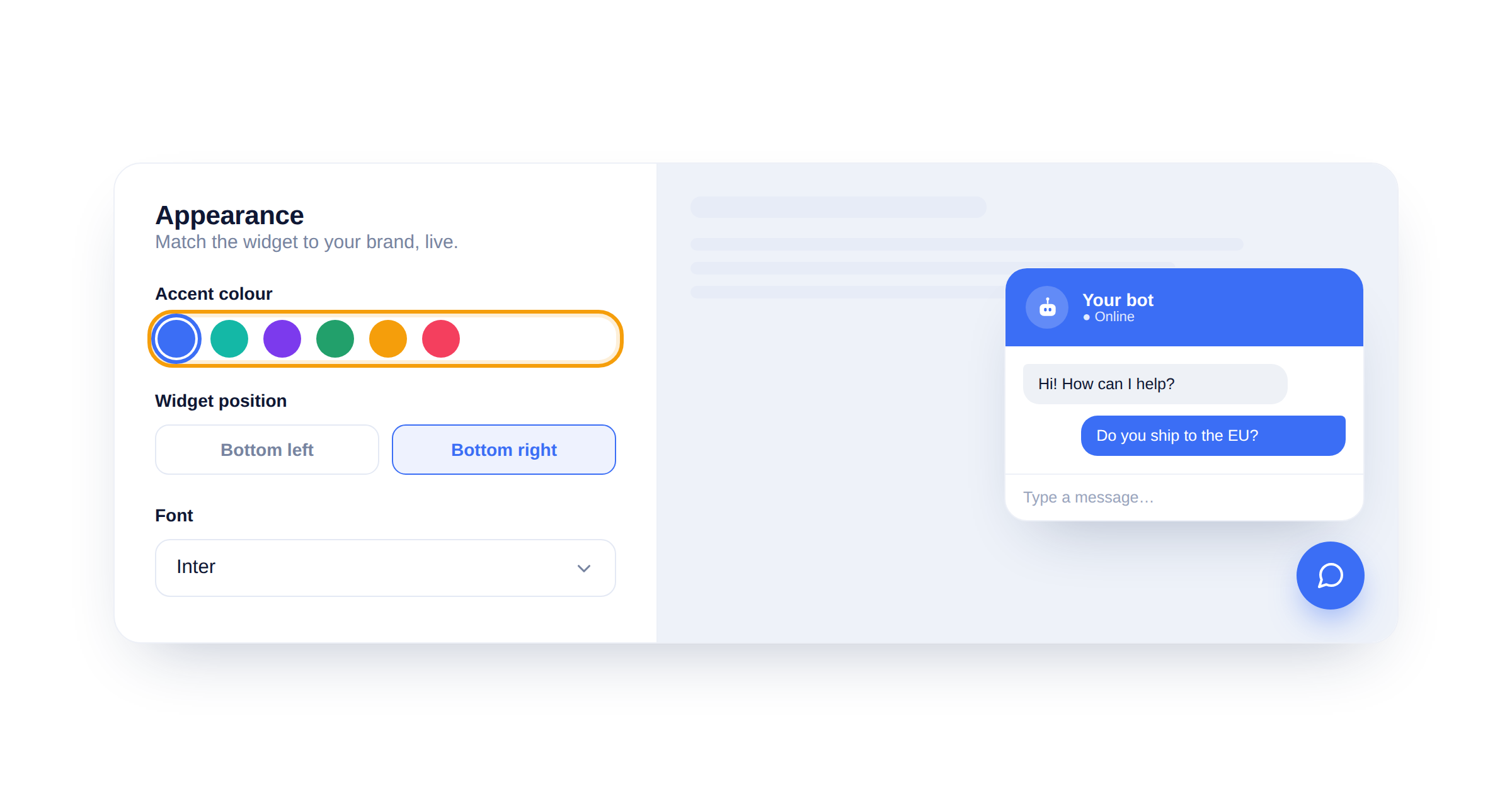
Set your accent colour
Pick an accent colour and the header, buttons and visitor bubbles all switch to it. Choose a preset or paste your exact brand hex.
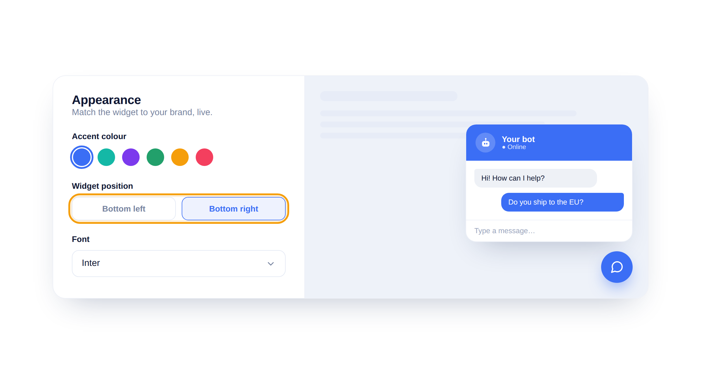
Choose which corner it sits in
Under Widget position, drop the launcher in the bottom-right or bottom-left. Bottom-right is the norm; move it left if it covers something on your site.
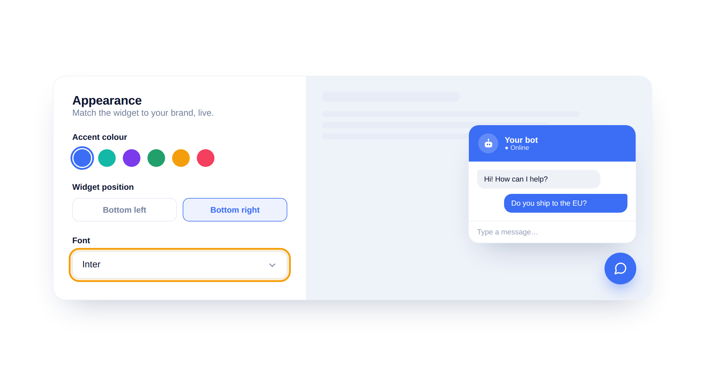
Match your font
Set the Font to the one your site uses. The preview re-renders instantly so you can check it still reads well at chat size.
Use your exact brand colour
Paste the same hex you use on your buttons and links. The exact colour feels built-in; a near-miss feels bolted on.
Did this answer your question?
Still need a hand?Email our team and we answer within one business day.